How ?

How to Ensure Your Website is Mobile-First

Today, having a mobile-friendly website is not just a nice-to-have; it’s a must. With over 60% of all web traffic coming from mobile devices, it’s crucial to focus on making your website work well on smartphones and tablets. A mobile-first approach means designing your website with mobile users in mind first, ensuring a smooth experience for them before considering larger screens. Here’s a simple guide on how to make your website mobile-first.

How to Ensure Your Website is Mobile First.
What is Mobile First Design?

What ?

What is Mobile-First Design

In the digital world today, most people browse the internet using their phones. A mobile-first design means building your website primarily for mobile users, before you even consider the same for the desktop users. It also makes sure that your mobile visitors enjoy their experience after visiting your website or blog.

Why ?

Why Mobile-First Design is Important

Better User Experience

Responsive design ensures that your website is optimized for phones making visiting easier for website visitors.

Higher Google Rankings

Mobile friendliness is one of the requirements that Google looks at and so when you design for mobile first, you stand a better chance of ranking better on it.

More Sales

When your site works well on mobile, users are more likely to engage and make purchases.

Stay Competitive

A mobile-first website helps you stand out from competitors who haven’t optimized their sites.

Inclusive Access

It ensures that everyone, including people with disabilities, can use your website easily.

Prepared for the Future

As mobile usage continues to grow, a mobile-first site keeps you ahead of the curve.

Better Local Search

If you’re targeting local customers, a mobile-first design improves your visibility in local searches

How ?

How to Make Your Website Mobile-First

Start with Mobile Designs

Begin by designing your website with mobile screens in mind. Keep the layout simple and focus on the most important content.

Optimize Images and Media

Images should be optimized for desktop, mobile and tablets, minimize use of large media files, and lazy loading of images respectively.

Use Responsive Design

Moreover, you need to make sure that your website changes its display depending on the device that is used – be it a phone with a small screen or a desktop computer.

Simplify Navigation

Some of the common menus that are easy to use include the hamburger menu, and should not be many options in the menu bar.

Focus on Speed

Cut down on the number of calls to the site, enable Get browser caching and use content delivery network for faster content delivery.

Test on Multiple Devices

Use tools to test how your website looks and works on various mobile devices and screen sizes

Make Forms Mobile-Friendly

Keep forms short, use mobile-friendly inputs, and make sure buttons are easy to tap

Ensure Accessibility

Make sure your site can be used by everyone, including those who use screen readers or rely on keyboard navigation.

Why Adept Digitals for Mobile Optimized Design
block of white black Image

About

Why Adept Digitals

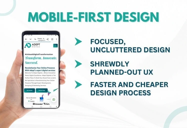
Partner with Adept Digitals for a mobile-first web development strategy.

At Adept Digitals, we design websites that prioritize mobile responsiveness, delivering fast, user-friendly experiences for on-the-go users. With mobile-first solutions, we ensure seamless performance and accessibility, empowering your business to reach more users on any device. Contact us today for more information.

0 +

Successful Projects

0 +

Happy Customers

0 +

Countries served

Conclusion

Key summaries

Conclusion of Mobile first design.

Mobile first, it is not just about designing to look good on the web but on the mobile. Mobile first is not just a design aesthetic; it’s about waking up in the morning and trying to build something that is both simple and satisfying to use. Following the above steps will make your website to be fully mobile first, hence promote high level of interaction, better search engine position and high business returns.

Partner with Us!

At Adept Digitals, we specialize in building mobile-first websites that not only look great but also perform exceptionally well. Whether you’re starting from scratch or need to improve your current site, our team is here to help you succeed in the mobile-first world.

Partner With Adept Digitals

worldwide partners

Trusted by Happy Clients Worldwide

Review

Clients' Testimonials

Kevin De Vries Founder & CEO of Roasmarketing

Adept Digitals has been worked with me on many projects, What we like most is that delivery is fast, communication is good and They are always looking for a solution, just like us! Perfect match!

Viren Bhavsar Account & Marketing Head of Chandrasnacks

They worked on our project and have done a fabulous job! Keep up the good work team!

Pavitra Creations Founder & CEO of PC Chocolatier

I have work closely with Adept Digitals and feel fully confident in expressing my endorsement. my website generating more organic traffic and more orders which exactly what I needed. The owner and her associates have amazing customer service.

Ready to go mobile-first?

Contact Adept Digitals today

CTA-Adept 2 tablet Image
Scroll to Top