What ?

What is Mobile First Indexing?

Mobile-first indexing means that Google now uses the mobile version of your website as the main basis for ranking it in search results. In the past, Google used the desktop version of a site to decide its ranking. However, since most people now browse the internet on their smartphones, Google switched to focusing on mobile. This change ensures that websites that work well on mobile devices—meaning they load quickly, are easy to navigate, and display correctly—are ranked higher.

If your mobile site isn’t optimized or doesn’t perform well, it could hurt your ranking in Google’s search results, even if your desktop site is excellent. So, it’s important to make sure your website is mobile-friendly to stay competitive in search rankings.

Phone with magnifying glass surrounded by icons representing search, tools, location, and stores.
Mask-Group Image
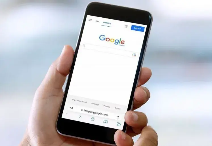
A hand holds a phone displaying the Google search page.

Why ?

Why did Google shift to Mobile First Indexing?

Google shifted to mobile-first indexing because more and more people are using their smartphones to browse the internet. In fact, over half of global web traffic now comes from mobile devices, and this number keeps growing. Google wants to provide the best experience for users, and since most of them are on mobile, it made sense to prioritize mobile-friendly websites.

Before mobile-first indexing, Google ranked websites based on their desktop version. This created issues because some websites had a great desktop experience but a poor mobile one. Users browsing on mobile devices would end up with slow-loading pages, hard-to-read text, or awkward navigation. By focusing on mobile-first, Google ensures that the websites that rank well provide a smooth and fast experience for mobile users, who are now the majority.

Impact

Key Changes in SEO Strategy Due to Mobile-First Indexing

Learn how mobile-first indexing changes SEO by focusing on mobile optimization for better user experience and rankings.

Mobile-Friendly Design

Websites must be responsive and adapt to any screen size to ensure a smooth user experience on mobile devices.

Page Speed

Faster load times are crucial for mobile SEO. Compressing images, reducing code, and using browser caching have become key strategies to improve speed.

Content Parity

The mobile version of your site should have the same content, images, and structured data as the desktop version. Any missing elements can hurt your rankings.

Improved Mobile UX

Focus on easy navigation, clickable buttons, and readable text to keep users engaged and ensure they stay on your site.

Optimized Structured Data

Ensure schema markup and other structured data are properly implemented on mobile for better search visibility.

Core Web Vitals

Optimizing for mobile-specific metrics like loading speed, interactivity, and visual stability is now essential to rank higher in search results.

Mobile-First Testing

Regularly test your site on different mobile devices using Google’s tools to identify and fix any mobile-specific issues.

Local SEO Emphasis

Since many mobile users search locally, optimizing for local SEO—including location-based keywords and Google My Business—has gained more importance.

Comparision

Mobile-First Indexing vs. Desktop Indexing in SEO

Understand the differences between mobile-first and desktop indexing in SEO and their impact on search rankings.

Primary Focus

Mobile-First Indexing

Google primarily uses the mobile version of a site for ranking and indexing.

Desktop Indexing

Google used to rely on the desktop version of a site for indexing and ranking.

User Experience

Mobile-First Indexing

Prioritizes mobile-friendly websites, favoring design and fast loading on mobile.

Desktop Indexing

 Focused on the desktop user experience, often ignoring mobile performance.

Ranking Impact

Mobile-First Indexing

Desktop focused sites may see a ranking drop, if their mobile version is not strong.

Desktop Indexing

Mobile-friendliness had minimal impact, with rankings based on desktop performance.

Content Consideration

Mobile-First Indexing

Consider mobile versions for ranking, so all key content must be available on mobile.

Desktop Indexing

Content from the desktop site was the main factor, without emphasis on mobile-specific adjustments.

SEO Optimization Requirements

Mobile-First Indexing

Requires mobile-friendly, responsive layouts, and fast mobile page speeds to perform well.

Desktop Indexing

Optimized mainly for larger screens, sometimes neglecting mobile optimization.

Indexing Shift

Mobile-First Indexing

The default indexing method for all new websites, with older sites gradually moving to this model.

Desktop Indexing

Desktop was Previously the standard but now largely phased out in favor of mobile-first.

Optimize

Best Practices for Better SERP Rankings

  Explore effective strategies of mobile first indexing to improve your website's visibility and achieve higher SERP rankings.

Make Your Site Mobile-Friendly

 Ensure your website looks good and works well on mobile devices. Use responsive design so that all elements, like text, images, and buttons, adjust properly on small screens.

Speed Up Your Website

Mobile users expect fast websites. Compress images, remove unnecessary code, and use tools to make your site load quickly. Faster sites perform better in search rankings.

Keep Content the Same

Make sure the content on your mobile site is the same as on your desktop site. If you have less content or different information on mobile, it can hurt your SEO rankings.

Focus on Mobile User Experience

Ensure your website is easy to navigate on mobile. Buttons should be easy to tap, text should be readable, and pages should be simple to browse. A good experience keeps users engaged and improves SEO.

Caution

Top 3 Mistakes to Avoid with Mobile-First Indexing

Learn about the common pitfalls in mobile-first indexing and how to avoid them to ensure your site ranks effectively.

Database icon connected to three square icons below it, suggesting data distribution.

Overlooking Structured Data

Not using structured data on your mobile site can hinder search engines from understanding your content. This may lead to missed opportunities for rich snippets, which can enhance visibility in search results.

link icon with url text

Using Different URLs for Mobile and Desktop

Having separate URLs for mobile and desktop can create issues with indexing. It’s better to use responsive design to ensure that search engines only have one version of your content, preventing dilution of your SEO efforts.

Smartphone displaying a clock face with an upward curving arrow

Failing to Test on Real Mobile Devices

Relying solely on simulators to test your mobile site can be misleading. Always check how your site performs on actual devices to identify usability issues that might not appear in testing tools.

Thoughtful man surrounded by icons for SEO, marketing, web design, e-commerce, and branding.
block of white black Image

About

Why Adept Digitals

Partner with Adept Digitals for your end-to-end Web designing solutions.

At Adept Digitals, we know how important mobile-first indexing is for your website’s success. We specialize in making sure your site is fast, easy to use, and looks great on both mobile phones and desktops. Our team focuses on improving mobile design, loading speed, and making sure your content works perfectly on any device. With our help, your website will be fully ready for mobile-first indexing, giving you a better chance to rank higher on Google.

0 +

Successful Projects

0 +

Happy Customers

0 +

Countries served

Conclusion

Key summaries

Mobile-first indexing has changed how websites are ranked, and being mobile-friendly is more important than ever. If you want to keep your site competitive, reach out to Adept Digitals. We can create a custom plan to make your website mobile-ready and boost your search rankings. Contact us today to get started!

Business professional discussing their project

worldwide partners

Trusted by Happy Clients Worldwide

Review

Clients' Testimonials

ROAS solution logo
Kevin De Vries Founder & CEO of Roasmarketing

Adept Digitals has been worked with me on many projects, What we like most is that delivery is fast, communication is good and They are always looking for a solution, just like us! Perfect match!

NSB logo
Viren Bhavsar Account & Marketing Head of Chandrasnacks

They worked on our project and have done a fabulous job! Keep up the good work team!

PC chocolatier logo
Pavitra Creations Founder & CEO of PC Chocolatier

I have work closely with Adept Digitals and feel fully confident in expressing my endorsement. my website generating more organic traffic and more orders which exactly what I needed. The owner and her associates have amazing customer service.

Want to adapt your SEO strategy for mobile-first indexing?

Get in touch with Adept Digitals for a personalized plan that drives results!

Conclusion of why responsive web design matters Image
Scroll to Top